Client: Military Childcare (MCC)
Project: Desktop and Mobile Redesign
User Access: None, stakeholder only
Lesson(s) learned: Learned to create "mock" higher fidelity designs using Balsamiq (hence the "mock") in order to better convey design concepts to client. The team was not allowed to use Axure, or any other higher fidelity prototyping tool.
THE PROBLEM:
- Redesign the internal and external sites for militarychildcare.cnic.navy.mil using Prime NG (Angular library) components while maintaining the organization's existing content and color scheme. Provide ongoing UX support to business analysts and developers. Create a library of UX deliverables to including Personas, Design Pattern Guides, Wireframes, Heuristic Evaluations, and Balsamiq Templates. Finally, successfully transfer all deliverables to the business analysis team to continue work on the redesign project after 6-months.
THE APPROACH:
- I relied heavily on the knowledge of my veteran team members for much of my deliverable and design decisions. For one, we were not allowed to speak with actual users. The user knowledge I gathered came directly from the stakeholders themselves. Our goal, as a team, was to find a balance between educated assumptions (from stakeholder interviews) and what the team could likely accomplish in 6-months. The latter involved redesigning the site almost entirely in Angular - using the Prime NG library, which allowed developers to program at a faster rate. As the only UX Analyst in the team, my role was to not only sell and defend designs from a UX perspective, but also make sure that the developers had a point of contact for all design decisions throughout sprints. Initially, my required deliverables were Wireframes and Design Pattern Guides. However, as we learned more about our client's design aptitude, I recommended Heuristic Evaluations and Personas - to help the client understand our design recommendations and the UX process.
Heuristic Evaluation
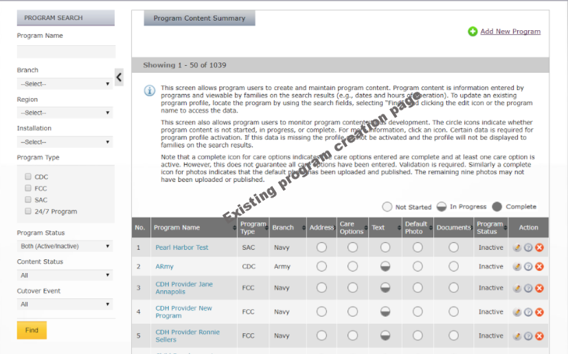
MCC provides access to child care service providers to military families domestic and internationally. As a result, it is a massive management site that provides tools for care identification and selection (for families) and care service provider management for staff of various permission-based access. Since I was unable to speak with users my first act was to create a heuristic evaluation to capture some of the low hanging fruit issues, and to get an idea of my constraints both from a programatic perspective, but also from a policy perspective (identified after numerous discussions with veteran team members). What I found is that the current site was useful, but cumbersome. Customers and staff were able to use the site but only because they're a captive audience. We aimed to create an improved minimalist design (as much as possible).
Wireframes
All wireframes were done with Balsamiq. Initially we attempted to provide rapid wireframes by utilizing Balsamiq's sketch mode only. However, the client depended on more realistic designs in order to frame their decisions. All UI components were designed with Angular (Prime NG) in mind so that we could ensure rapid development and responsive design. The mobile wires you see here reflect the PrimeNG responsive nature. The design of the consumer site was targeted toward focusing the consumer to their number one task: finding care. All other features of the site such as content were decreased in importance.
Personas
Personas were created as supportive artifacts to help the client and developers keep their users in mind. This was one of the toughest tasks to do, because we did not speak with users. At best, my data was based on a highly educated guess brought about by discussions with the client and veteran team members. My Personas were watermarked as Draft precisely because the client needed to understand that these were living documents, requiring actual user data and continued work from the client-side (those who have access to users.)
User Flow
Another difficult task was identifying the paths users take to accomplish a task. On the left is an example of the consumer user flow (both logged in and logged out). The goal here was to chart what content was available to users, work on identifying a happy path, and start discussion about what pages would remain. This was difficult because there was no actual data on how users navigate the site, what is important to them, what blocks them etc. - all questions that usability studies would help answer. This part of the project depends on continued discussions with the client.


